

Wealth Strategies
Believe Your Eyes: Getting Investment Messages Across

A regular contributor to this publication illustrates how non-textual visuals can be potential explanations of investment trends.
A picture says a thousand words. We’ve often read the expression, and it is often true, And pictures, graphs, charts and other visuals can often be more compelling than any number of words if they push the reader past certain misconceptions. This applies in the investment and wealth management world – think about how a graph showing big drawdowns or relative performance can stick in the brain more effectively than a few paragraphs. At a time when the insights from so-called behavioral finance, such as showing how investors aren't always as rational or objective as they like to think, visual representation of what goes on in markets can be particularly powerful.
When wealth managers read pitches from fund managers, or want to understand what sort of information they are getting, there is a need very often to get the visuals right. Client reporting is, as the industry increasingly realizes, an important differentiator, and with mobile devices and other technologies making it easier for clients to get a “helicopter view” of investments, the visual dimension comes alive even more.
With this in mind, regular FWR contributor Diane Harrison considers some of the tricks and benefits involved in visual representation of investments and market developments, with some tips about errors to avoid. We hope that readers find this article of interest; the editors don’t of course necessarily endorse all views of guest writers and invite responses. Email tom.burroughes@wealthbriefing.com. (See below for more about Diane and her business.)
It’s simple human nature to believe more of what you see than what you hear. The human brain is wired to process visual information more easily than contextual words. According to a June 15 Washington Post article, “Charts Change Hearts And Minds Better Than Words Do”, charts are a more effective visual than tables of text. Data, particularly complex or vast amounts of data, which is arranged in a graph or other summary picture, is better understood when translated into an optic.
Show and tell
Pictures can tell compelling stories. When trying to sell an
alternative investment concept, the strategic use of graphics can
punctuate the point you are trying to make, such as Alternative
Asset Selling Point 101 - portfolio allocation performance
increases while volatility decreases with the inclusion of
alternatives into traditional asset classes. How much stronger is
this point made when showing the impact alternatives have on a
portfolio mix such as the comparison does below?
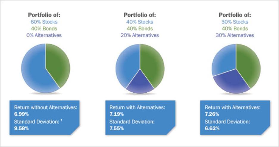
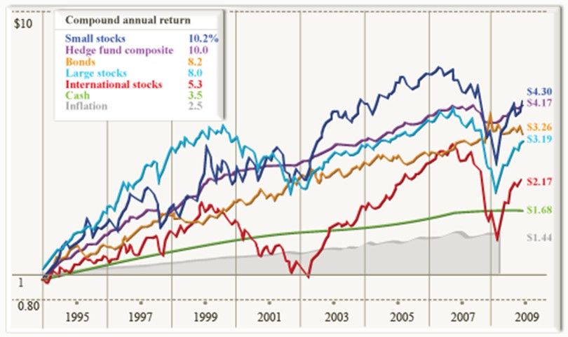
Most numerical conclusion points can be strengthened by accompanying the wording with some form of visual marker. Alternatives marketers frequently show multiple asset class performance comparisons in an effort to convince investors to allocate more of their funds to the alternatives category. It’s clearly a more powerful statement to make for alternatives to showcase the strong relative performance this asset class reflects over a medium to long period of time, such as on the Morningstar graph following:
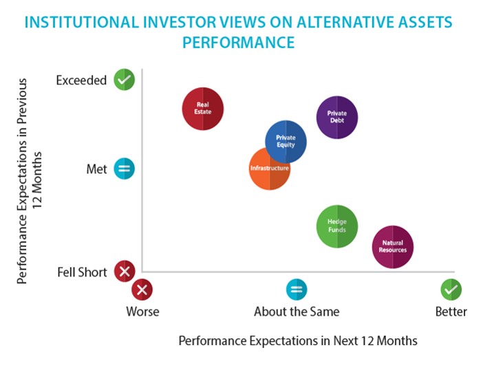
But it doesn’t just apply to showing the numbers story. Visuals
can also be useful to capture investor sentiment preferences and
survey data conclusions. Preqin’s INVESTOR OUTLOOK: ALTERNATIVE
ASSETS H1 2017 included a particularly powerful graphic for
summarizing investor sentiment regarding several asset classes as
shown here:
Kiss: (Keep it simple, s****d!)
Synthesizing lots of information or complex information into a
clean and simple format is always a positive marketing tool. A
key selling feature of alternative assets is to be able to
demonstrate the benefits of its non correlation to traditional
asset classes and its performance when these traditional asset
classes are stressed.
For example, one of the strongest selling points for including managed futures into an overall portfolio to increase diversification and uncorrelated market performance is to demonstrate how divergent the performance of this asset class has been in past decades. This point is often referenced by alternatives marketers through referring to statistical studies and research, but that is a dry and clinical format in most cases. The graph following, courtesy of Witherspoon Asset Management, visually encapsulates the outperformance of managed futures, as represented by the BTOP50 Index, versus stocks emphatically for potential investors.
The performance of managed futures historically has excelled during periods of severe US stock market falls.
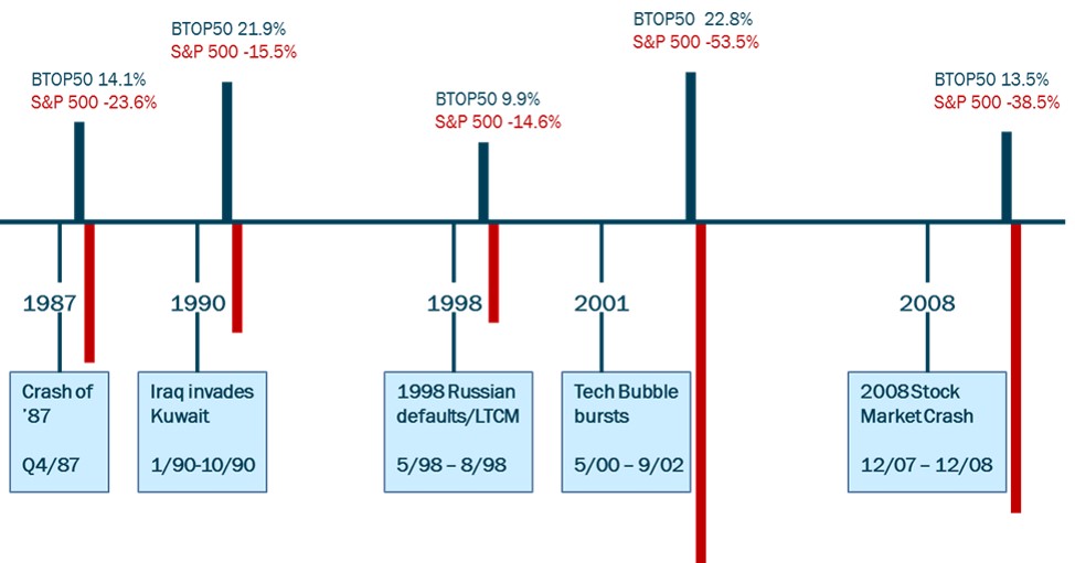
The performance for the Barclay BTOP50 Index does not reflect
any fees or expenses for the index as a whole, but does reflect
the underlying fees and expenses of the managers contained
therein.
The previous graphic is a good example of aggregating multiple concepts into one clear image. Too much data when described in a series of statements to make a single point often gets diluted in impact with the volume of information contained. Sometimes, though, you want to emphasize a single point, perhaps as an opening to a topic which will be addressed in a longer fashion. Here is another important opportunity to have a strong visual graphic lend its focus to the topic at hand.
For example, the graph which follows illustrates the following statement with a lot more visual punch than this description: “Crude oil was in an extended slump since the third quarter of 2014. Demand was muted due to weak global economic growth, while production was increasing even as inventories were building.”
Comparison of S&P 500 Index and West Texas Intermediate Crude
September 2007 through December 2015

When marketing alternatives to investors, it’s important to communicate a clear message and develop a consistent selling strategy. The inclusion of graphics that help tell that story and sell the concepts within can go a long way to assist in the success of this effort. Wherever possible, think of ways in which you can illustrate the information that you are trying to convey and develop a library of graphics that reinforce the information which can be used across a variety of media formats.